123FormBuilder Knowledge Base
Search our documentation platform for answers, service specifications and 3rd-party integrations.
How to use the 123FormBuilder editor to edit your web forms
The form editor of 123FormBuilder, your trusted online form maker, allows you to create and customize the structure of your web form in any way you want. You can add and edit basic and advanced fields, drag and drop sections, adjust the form layout and preview the result in real-time.
The Fields section is placed on the left side of the Form Editor, split into Essentials, Contact details, Media & Structure, Uploads & Consent, Date & Time, Rating scales, E-Commerce & Calculation.
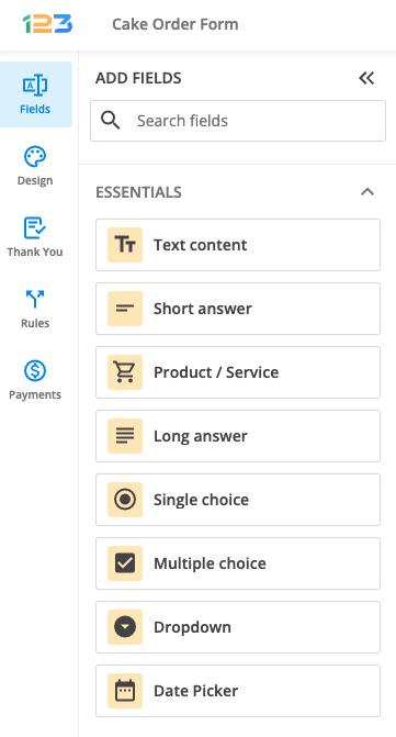
Essentials
Here you can find the basic fields that you can use to create your form:
- Text content allows you to type in a text or a description for your respondents
- Short answer helps you request a simple text input from your respondents
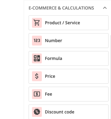
- Product/Service field helps you sell your products or services and allows you to put a product picture, description, quantity and price.
- Long answer are similar to short text fields, but they allow for more text input. For example, you may use text areas for comments or suggestions.
- Single choice allows respondents to choose only one item from a list of options.
- Multiple choice is displayed as checkboxes and allows your respondents to select multiple options from a list.
- Dropdown provides several options from which your respondents will have to select one.
- Date picker allows respondents to select a date from a calendar.
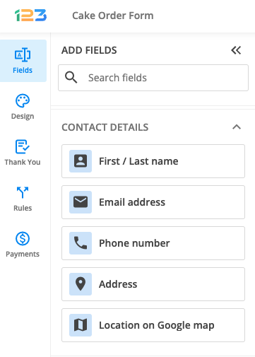
Contact details
This section provides a range of fields for requesting contact data from your respondents.
- First/Last name helps you gather name information from your respondents. You can also add title, middle name or initials.
- Email address collects your respondents’ email addresses and you can also set validations in place to make sure that the data you’ve collected is valuable.
- Phone number can be customised to accept different phone number formats
- Address is a complex field of 6 subfields that can be easily customised based on your needs. In this way, you are making sure that you collect only the data you are interested in from your respondents.
- Location on Google map could be used to make your form more interactive for your respondents. All you have to do is to provide your Google Maps API Key
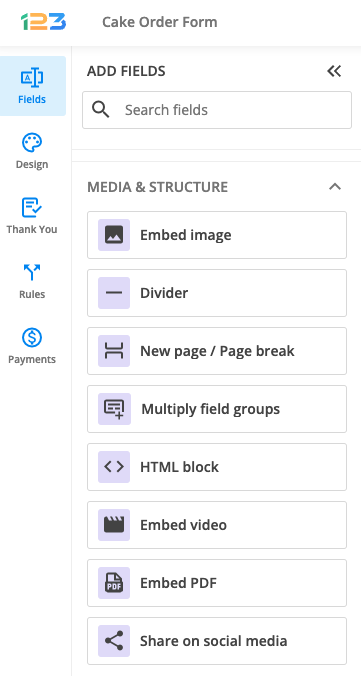
Media & Structure
In order to make your form more interactive for your respondents, you can use the following fields:
- Embed image allows you to add an image to your form
- New page/Page break is used to create a multipage form
- Multiply field groups is used to group a set of fields that repeats as needed, allowing respondents to input multiple instances. Respondents will be able to click on a button to generate an additional set of those grouped fields.
- HTML block allows you to insert customised text sections, links, images, and tables.
- Embed video is used to add a video to your form.
- Embed PDF allows you to add a PDF file on your form and your respondents can interact with it (read it, zoom in, zoom out, download, print)
- Share on social media comes in hand when you want to link your social media accounts to your form.
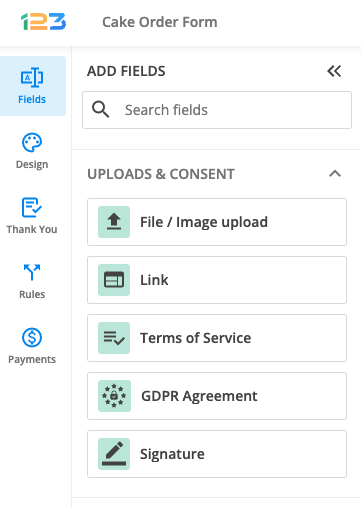
Uploads & consent
If you want to collect agreement from your respondents, these are the appropriate fields for you:
- File/Image upload allows your respondents to upload a file or an image for you.
- Link is used for your respondents to share a link on the form
- Terms of Service is used to request an agreement from your respondents.
- Signature allows you to get an electronic equivalent of the handwritten signature from your respondents.
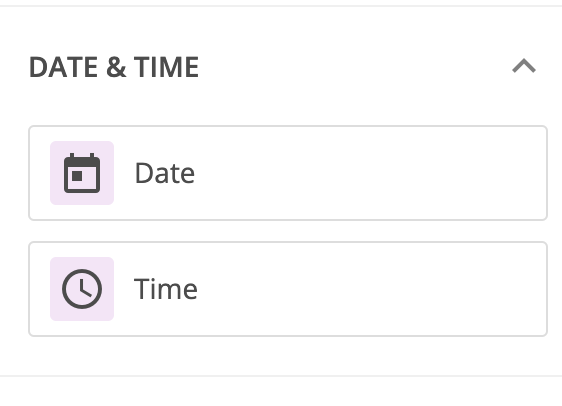
Date & time
If you are interested in collecting an exact date or time from your respondents, these two fields are the ones that will come in hand. You can select a date format, days you are going to accept from your respondents & default time and time format.
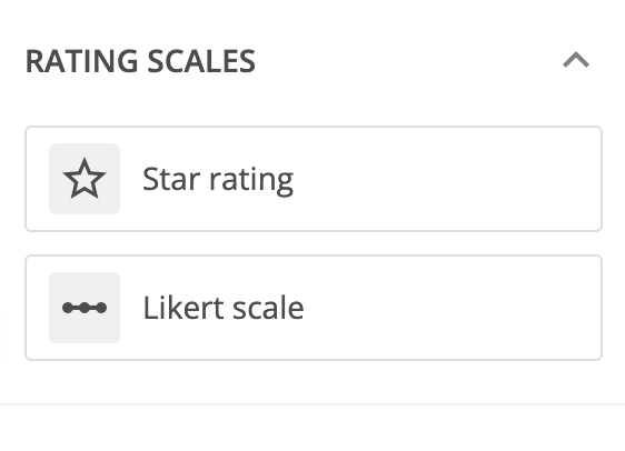
Rating scales
Rating scales are used to collect opinions and impressions from your respondents.
- Star rating shows by default 5 stars for your respondents and they can select the number of stars that they see fit for your statement.
- Likert scale is used to can insights about your respondents opinions about different statements.
E-Commerce&Calculations
- Number field is used to collect numeric data from your respondents.
- Formula will display the outcome of the formula you created on the form; e.g: if you want to sum up two number fields on your form, you can use Formula field to display the sum for your respondents.
- Price allows respondents to fill out a sum of money
- Fee is used to display a shipping fee
- Discount code allows your respondents to input a discount code to be applied to the form based on the validations you have created.
2 comments
Leave a Reply
Similar Articles
Frequently Asked Questions
Here is a list of the most frequently asked questions. For more FAQs, please browse through the FAQs page.
I’d like to know how to change the Form’s color at the top, it’s pink….Can I change that in editing?? Thank You! =D